
Colors in Life
Suzanne Newman Fricke, Ph.D.
With December, days grow shorter, trees lose their leaves, grass turns brown, and the skies are grey. It’s hard to stay optimistic, remember the sun, and maintain energy. For me, looking at art and having art in my daily life is a constant source of inspiration, and art created with vibrant colors captures my eye more than any other. Unlike black and white images, whether in photography or other media, colors are exciting, full of personality and attitude.
Colors help us define our lives. Christmas, for example, is expressed in red and green. Howard Johnson’s hotels and restaurants are decorated in their iconic orange and aqua. These color combinations are not accidental. Using color theory, the juxtaposition of red next to green, or orange next to aqua, follows the idea of complementary colors, placing colors opposite each other on the color wheel offers the greatest contrast, which allows the eye the easiest, more immediate perception of colors and the clearest distinction between the elements.

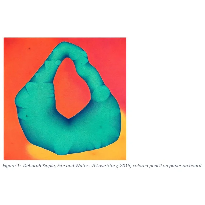
Complementary colors feature prominently in Deborah Sipple’s Fire and Water – A Love Story. With its blue-green central figure and bright orange-red background create a more three-dimensional quality to the image. Sipple’s chosen media, colored pencil on paper mounted on board, requires the artist to apply layer after layer of different colors for a subtle gradation and variance around the image. The work suggests something otherworldly, like a nebula seen through the lens of the Web telescope, a faraway place rich where energy transforms matter. As seen in this piece, the placement of colors next to each other does more than create contrast; visually, colors are perceived to mix. Vincent Van Gogh, an artist who studied color theory, was influenced by the law of simultaneous contrast as defined by Michel Eugène Chevreul. Chevreul argued that if two different colors are placed next to each other the colors visually combine as if the colors are actually mixed. By adding a darker blue outline around the central form, Sipple articulates the visual separation between the elements.
Analogous colors, the juxtaposition of colors next to each other on the color wheel, is the opposite of complementary colors. Used less frequently than complementary colors, analogous colors are harder for the eye to perceive so are more challenging for the viewer. In his famous paintings of sunflowers, Vincent van Gogh is famous for his use of analogous colors, juxtaposing colors that are next to each other on the color wheel, such as yellows and oranges.
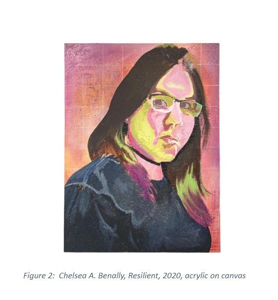
Chelsea A. Benally’s painting Resilient uses shades of pinks, reds, and purples in the portrait. Benally asks the viewer to look carefully and to spend time with the image, adding to its intimacy and focusing on the sitter’s complexity and strength.
Analogous and complementary colors can be used in combination, as in Vicente Telles’ painting La Guadalupana. For his retablo (saints on carved wood), Telles placed apple green next to blue then added orange and red for contrast, all created with natural pigments from clays and minerals on homemade gesso. This piece illustrates the procession of the Virgin of Guadalupe on the Day of Guadalupe, December 12. His colors are both soothing and vibrant, lovely and appealing.

The preference for certain colors often vary from culture to culture, something explored by the Russian-born and trained artists Vitaly Komar and Alexander Melamid in their 1993 series of paintings. Komar and Melamid hired the survey research firm Marttila & Kiley, Inc, to conduct a study of 1001 Americans, asking many questions about their artistic preferences. Then they created a series of paintings based on the results. They found that 44% of the polled Americans overwhelmingly preferred blue. Accordingly, when Komar and Melamid created a piece based on America’s preferences, with dominated by a blue sky and lake. (It also features a springtime landscape with people and animals, all reflecting the study’s results.)


Blue tones feature in Adrian Standing Elk Pinnecoose’s Chaotic Resilience. The artist, known for his complex CAD drawings, uses the color to link elements across his canvas, from the rotated rectangles to the Gothic buttressing, which offer a visual link and coherence across the canvas.

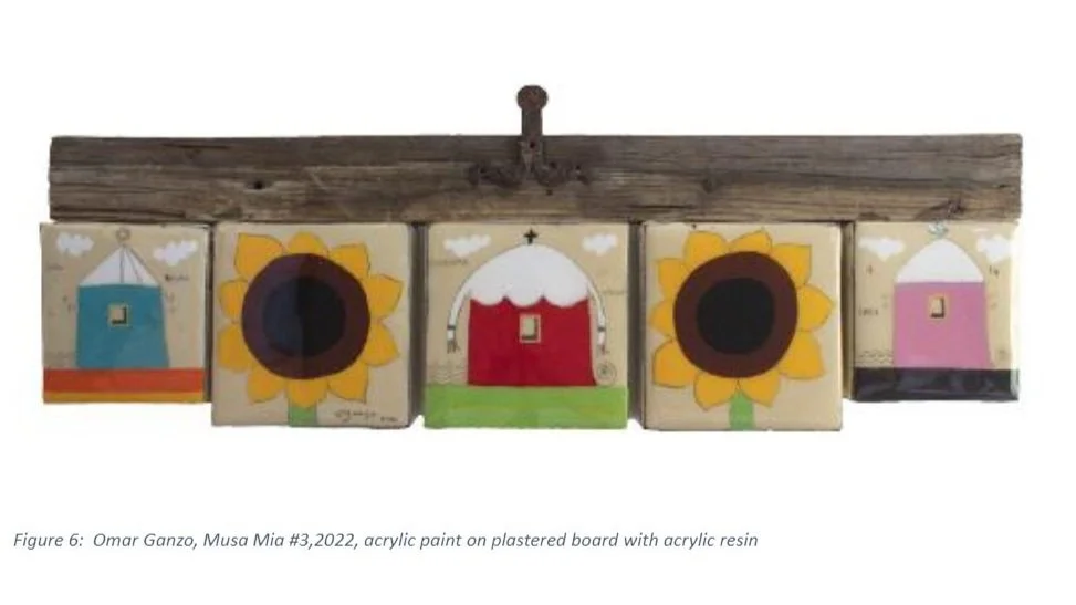
The highly saturated tones used by Omar Ganzo evoke strong reactions, usually suggesting strong emotions. The bright yellow of the sunflowers, the rich blue and red of the houses, add to the energy of the piece. The vibrant colors are mediated by the use of plaster on the base of the board, which ties the works to the artist’s Mexican heritage. Ganzo, who was born and raised in Mexico, references the work of Mexican muralists such as Diego Rivera, José Clemente Orozco, and David Alfaro Siqueiros.
In his multi-media piece, Alex Peña plays with value, juxtaposing lighter and darker areas to provide contrast. In Finding La Vie en Rose, Peña printed, painted, and drew on a piece of handmade paper, mixing figurative and abstraction. The floating frame underscores the paper’s delicate nature.
